
AI & Tech Company Profile July 9, 2024

WeldCraft: Modern & professional landing page for leading welding company

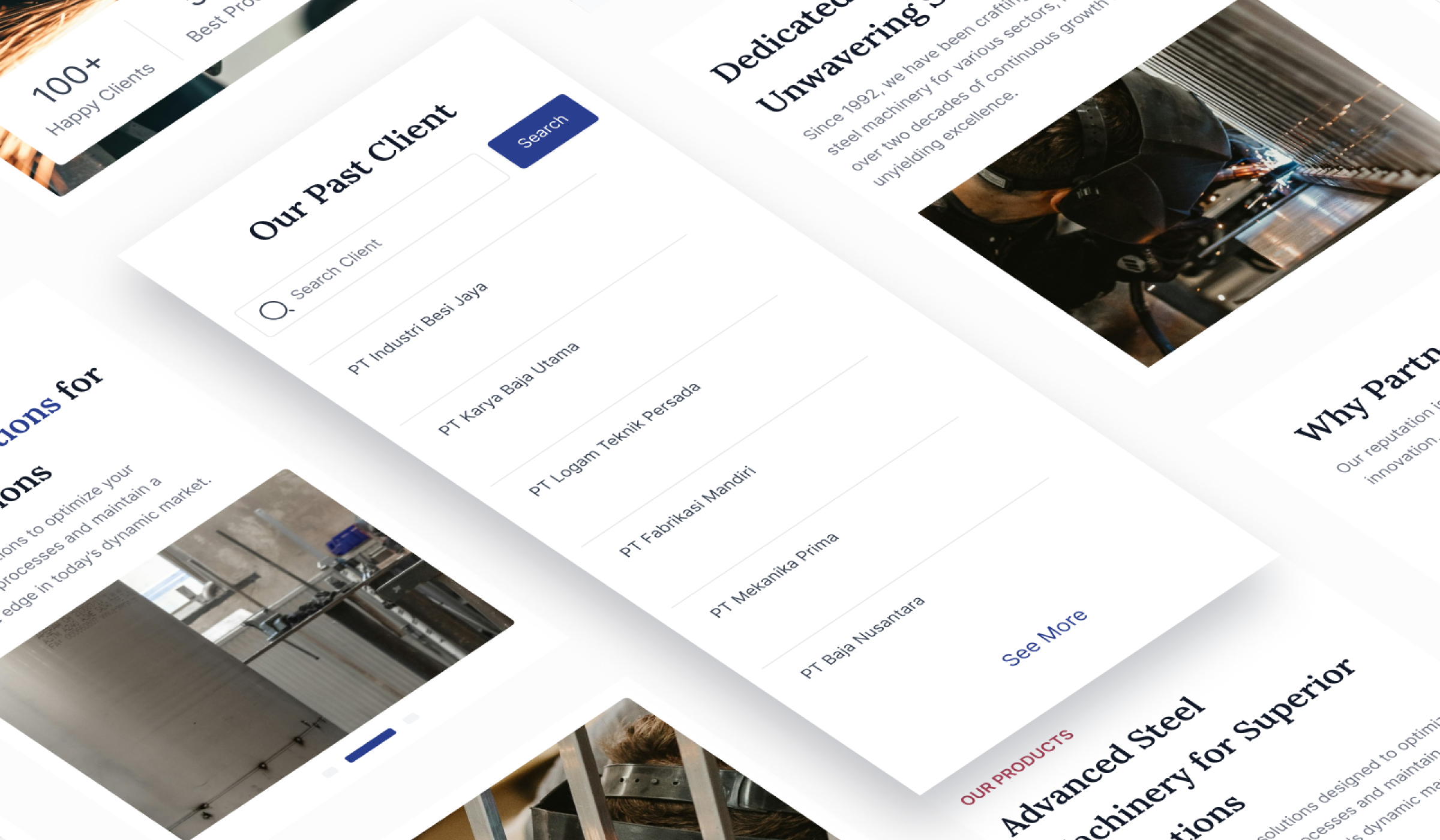
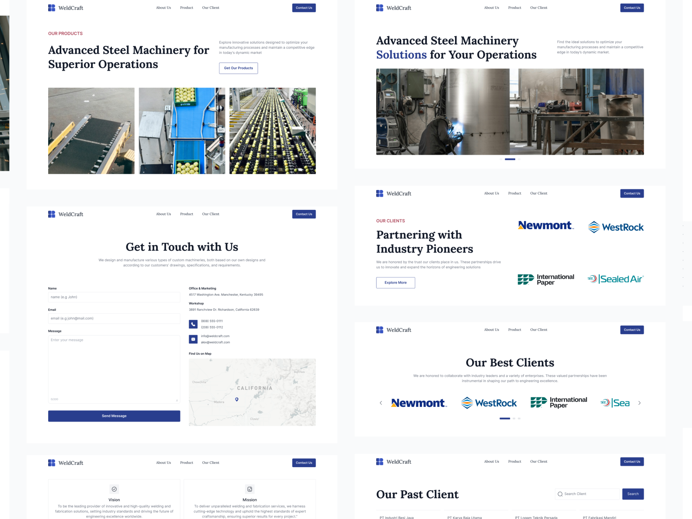
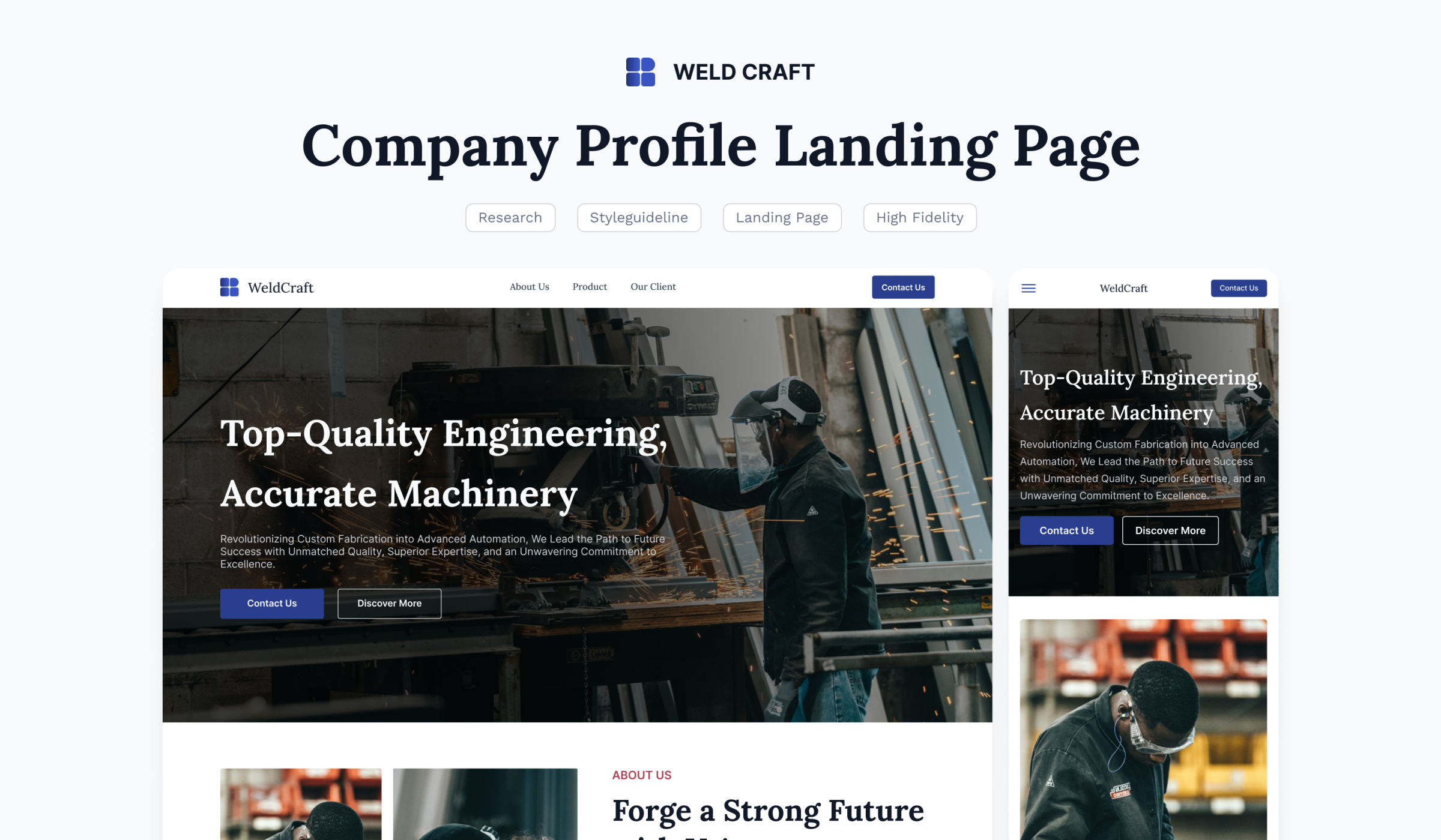
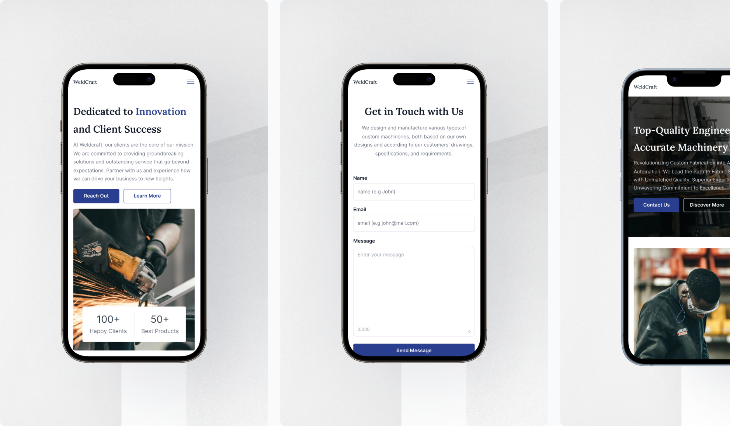
Weldcraft’s landing page serves as a digital showcase for premium welding services, highlighting expertise, past projects and available custom solutions. The platform is built to attract potential clients and provide insights into high-quality craftsmanship.

Task

Presents Weldcraft services, expertise and project portfolio to attracting new clients and strengthening industry credibility.
  • Strategy

    UX Research

  • Design

    UI/UX Design

  • Platforms

    Web Landing Page

⬤ 01. Overview

Weldcraft’s Expertise and Innovation

Weldcraft is recognized for its expertise in precision welding, using advanced technology and years of experience. They manage industrial projects with high accuracy, this will ensure durable and reliable results.

With a proven track record, clients can see the quality standards firsthand. Clear information and engaging visuals help potential customers understand their services effortlessly.

Design Beyond Expectations.

Transform your digital presence
with us.

Crafting user-centric designs that elevate brands and drive engagement.

⬤ 02. Detail

Building Trust
and Partnerships

Weldcraft ensures that information about their services is easy to access and understand, making it easier for potential clients and partners to evaluate their options.

With clear communication and a professional presentation, potential clients can confidently explore opportunities for new projects or long-term partnerships.

Color palette

/ WeldCraft
Primary
#293E8E
 

R 41
G 62
B 142
  

Bay of Many

Background
#FFFFFF
 

R 255
G 255
B 255
  

Pure White

Font
#667085
 

R 102
G 112
B 133
  

Pale Sky

The Bay of Many color was chosen as the primary shade because it represents strength and reliability, essential qualities in the welding industry. This also conveys professionalism and modernity, aligning with Weldcraft image as a provider of high-quality welding services. 

Pure White is used for the background to ensure a clean and readable layout, especially when presenting technical information and case studies. For typography, Pale Sky was selected to provide sufficient contrast without being overwhelming. This ensures readability and visual balance, particularly when explaining project details and technical expertise.

Typography

/ WeldCraft

Typefase 1        Typefase 2
Lora                     Inter

Lora & Inter selected as the primary typefaces to strike a balance professional aesthetics and optimal readability. Lora, with its elegant serif style, reinforces Weldcraft’s image as an experienced and trustworthy company. Inter, a modern sans-serif, ensures clarity and ease of reading, especially for technical details or instructional content.

Combination of Lora & Inter reflects professionalism and technical expertise while maintaining a smooth reading experience. Lora is used for headings and visually prominent elements, whereas Inter keeps body text clean and legible. 

Aa Bb Cc Dd Ee Ff Gg Hh Ii Jj Kk Ll Mm Nn Oo Pp Qq Rr Ss Tt Uu Vv Ww Xx Yy Zz
0 1 2 3 4 5 6 7 8 9

Aa Bb Cc Dd Ee Ff Gg Hh Ii Jj Kk Ll Mm Nn Oo Pp Qq Rr Ss Tt Uu Vv Ww Xx Yy Zz
0 1 2 3 4 5 6 7 8 9

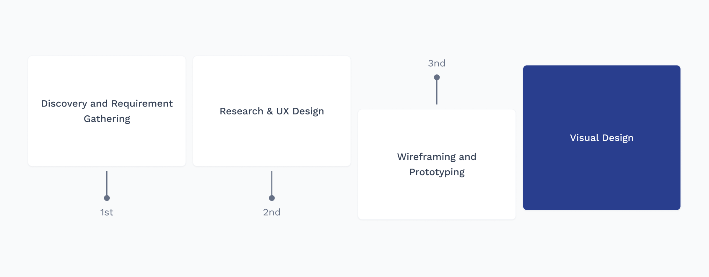
Design Process

/ WeldCraft

Testimonials

Let's get in touch,
we respond fast.

Ready to work together?
Back