
Fintech July 9, 2024

My Pension – Simple and Efficient Insurance Management App

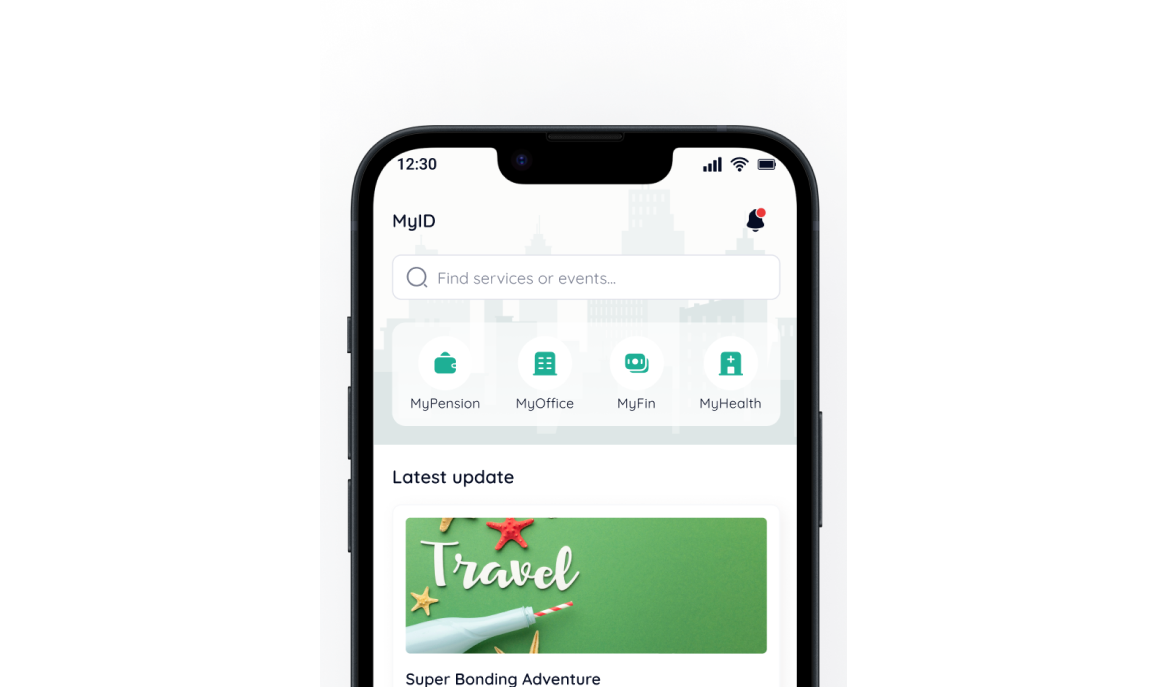
My Pension designed to simplify insurance policy management. With an intuitive interface and easy navigation, users can access policy details, manage claims, and find necessary services all in one platform.

Task

Allows corporate employees to easily monitor and enroll in their company affiliated insurance plans

  • Strategy

    Agile Method

  • Design

    UI/UX Design

  • Platforms

    Mobile App

⬤ 01. Overview

Easy Access to Employee Insurance

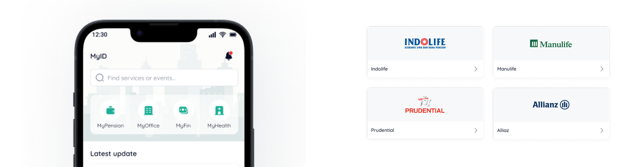
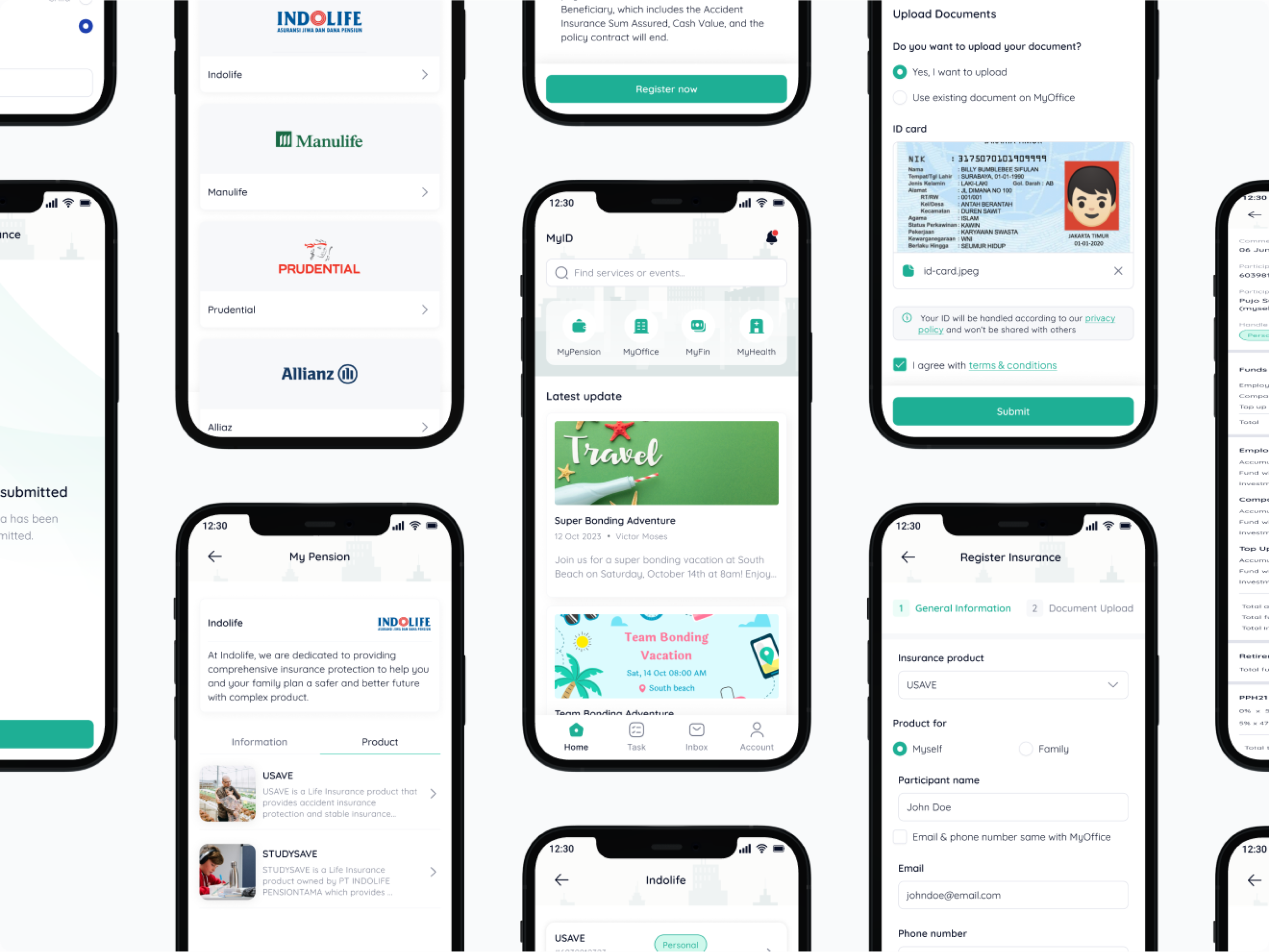
My Pension is designed to make it easier for corporate employees to access and manage their company-affiliated insurance plans. With an intuitive interface, users can browse insurance providers, check policy status and understand their benefits.

A clear navigation system and Structured information help employees not only understand their policies but also complete registrations quickly and efficiently.

Design Beyond Expectations.

Transform your digital presence
with us.

Crafting user-centric designs that elevate brands and drive engagement.

⬤ 02. How It Works

Fast and Convenient Insurance Registration

My Pension simplifies the insurance enrollment process with a digital system that allows users to upload documents, enter participant details and complete their registration in just a few steps.

My Pension ensures a seamless experience, allowing employees to easily enroll themselves and their families in the company’s insurance program.

Color palette

/ My Pension
Primary
#1EAF95
 

R 30
G 175
B 149
  

Mountain Meadow

Background
#FFFFFF
 

R 255
G 255
B 255
  

Pure White

Font
#060D24
 

R 6
G 13
B 36
  

Black Pearl

Color palette reflects professionalism and trust in insurance services. Mountain Meadow (#1EAF95) is chosen as the primary color for its modern, fresh and reliable feel, aligning with MyPension’s goal of simplifying corporate insurance management.

Pure White (#FFFFFF) keeps the interface clean and content focused, while Black Pearl (#060D24) as the text color provides strong contrast, ensuring readability and a professional appearance.

Typography

/ My Pension

Typefase
Quicksand

Quicksand is a typeface with soft and proportioned letterforms. Its rounded and balanced design enhances readability, making it ideal for an intuitive interface that caters to corporate employees who need quick and clear access to their insurance information.

Qucksand was chosen for its modern, professional and accessible feel, aligning with MyPension’s goal of providing an efficient insurance management experience. With high readability across different screen sizes.

Aa Bb Cc Dd Ee Ff Gg Hh Ii Jj Kk Ll Mm Nn Oo Pp Qq Rr Ss Tt Uu Vv Ww Xx Yy Zz
0 1 2 3 4 5 6 7 8 9

Design Process

/ My Pension

Testimonials

Let's get in touch,
we respond fast.

Ready to work together?
Back