
Company Profile E-Commerce June 13, 2024

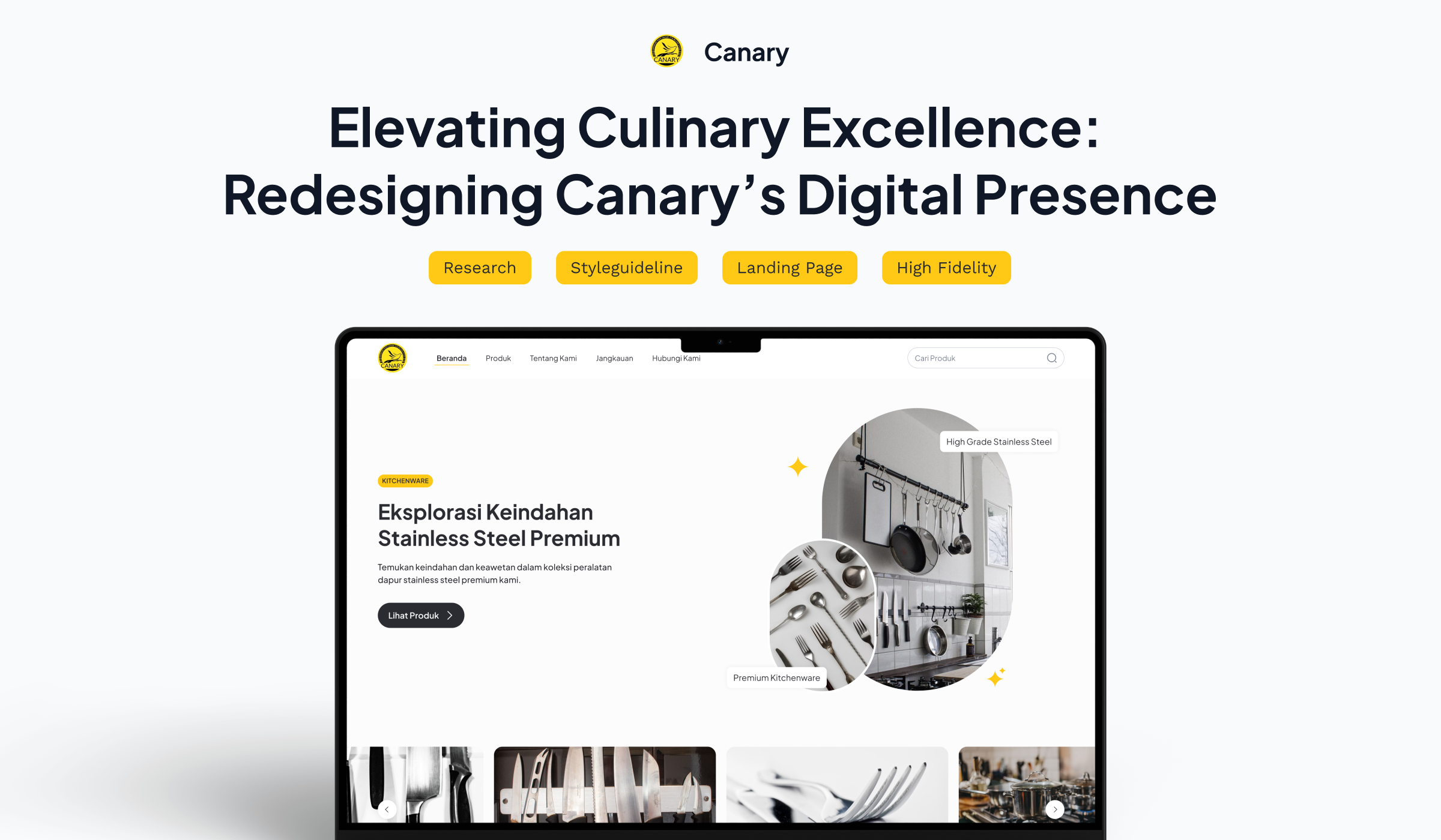
Elevating Culinary Excellence: Redesigning Canary’s Digital Presence

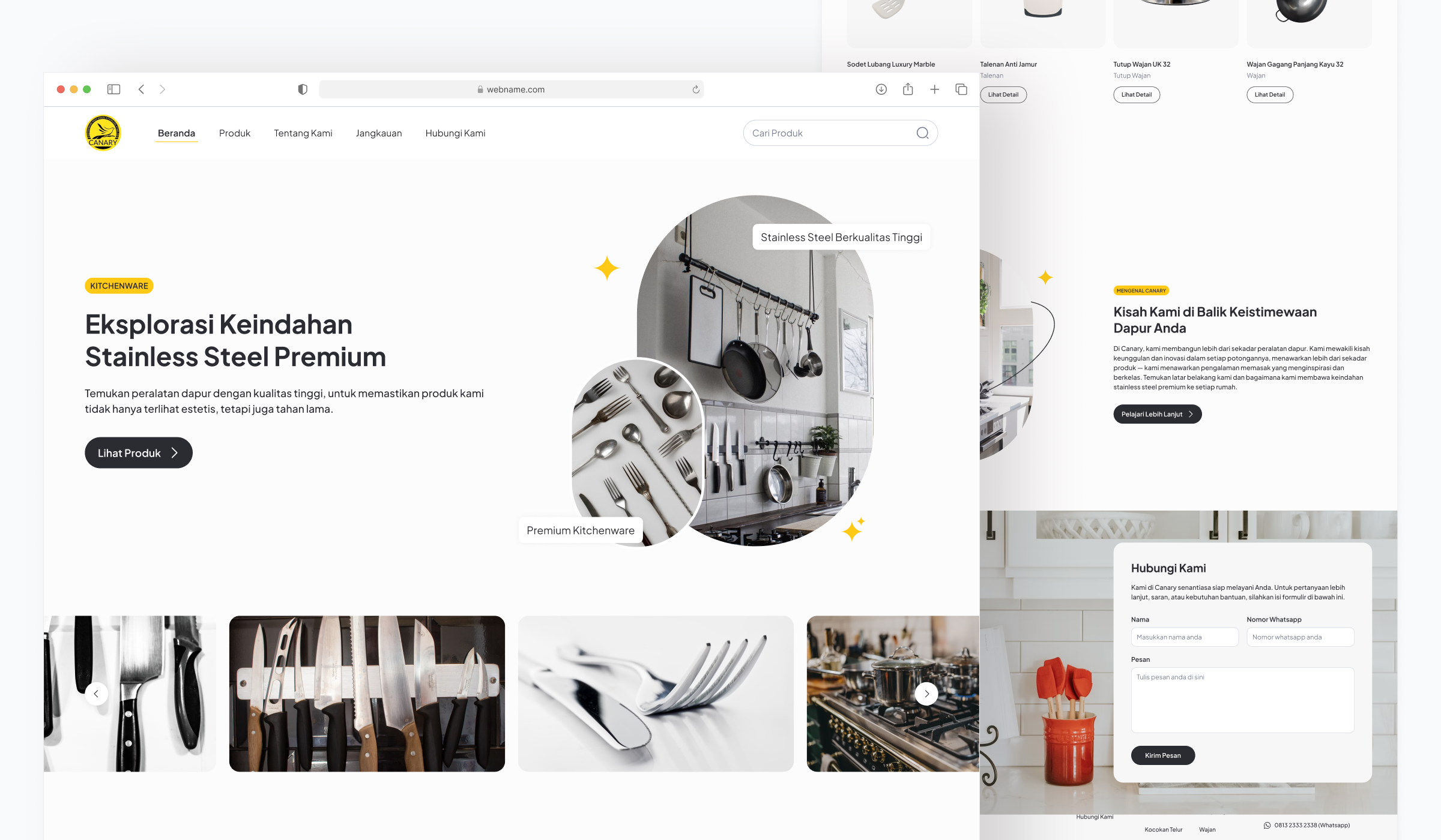
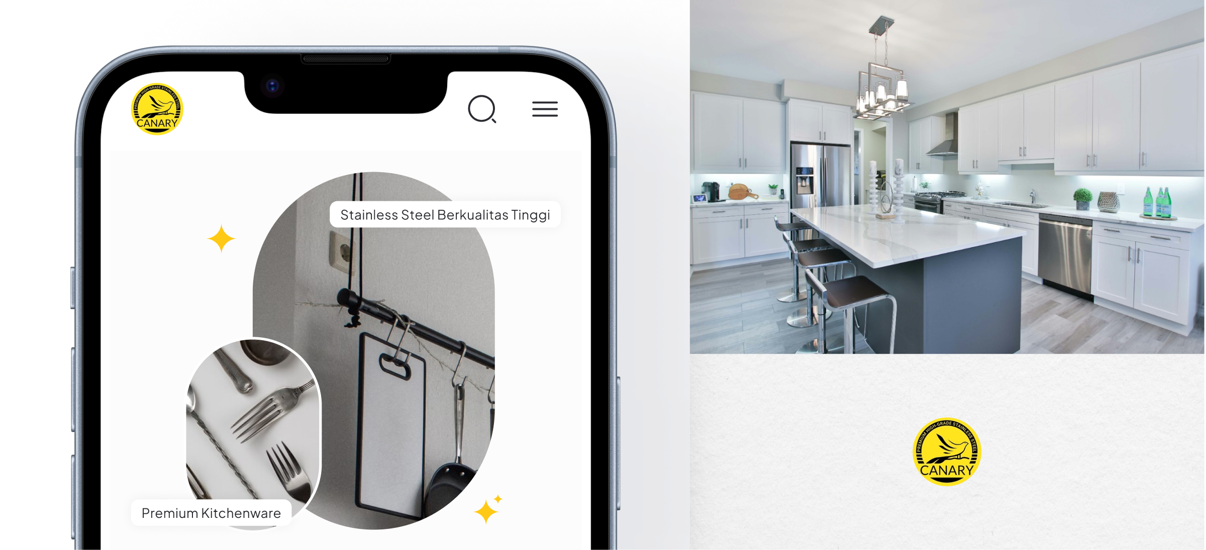
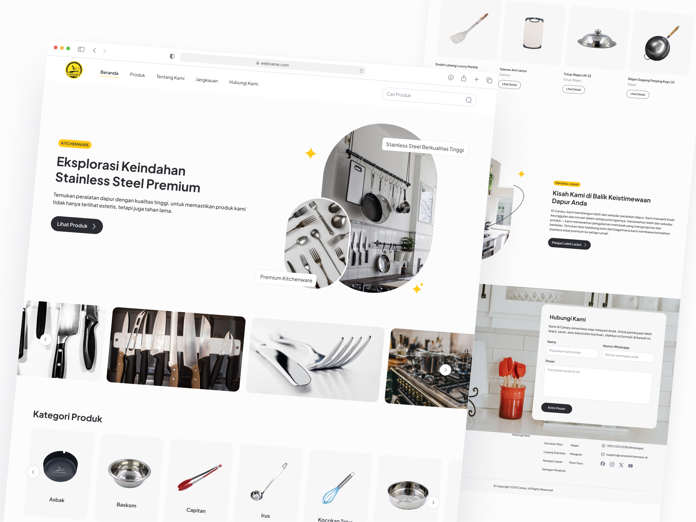
The Canary project was all about developing an engaging and comprehensive landing page for Canary, a company specializing in premium kitchen products. Our main goal was to create a user-friendly and visually appealing platform that highlights Canary’s unique offerings and provides detailed information about their range of kitchen essentials, including woks, bowls, and other kitchen must-haves.
We focused on delivering a seamless user experience with intuitive navigation and a streamlined purchasing process. The landing page showcases Canary’s brand identity and ensures that potential customers have all the information they need to make informed decisions.

Task

We designed and developed an engaging landing page with a focus on intuitive navigation, showcasing Canary's premium kitchen products and streamlining the purchasing process.
  • Strategy

    Kanban

  • Design

    UI/UX Design

  • Platforms

    Desktop

Open Project
⬤ 01. Overview

Discover and Shop Premium Kitchen Products with Ease

The Canary project involved creating an engaging, user-friendly landing page for a brand specializing in premium kitchen products. The main objective was to design a visually appealing platform that highlights Canary’s unique offerings, including woks, bowls, and other essential kitchen items, while providing detailed information for customers.

With a focus on seamless navigation and an intuitive purchasing process, the landing page ensures that users have an enjoyable and informative experience. By reflecting Canary’s brand identity, the platform effectively guides potential customers through the product range, making it easier for them to make informed buying decisions.

Design Beyond Expectations.

Transform your digital presence
with us.

Crafting user-centric designs that elevate brands and drive engagement.

⬤ 02. Detail

Showcasing Premium Kitchen Products with Canary

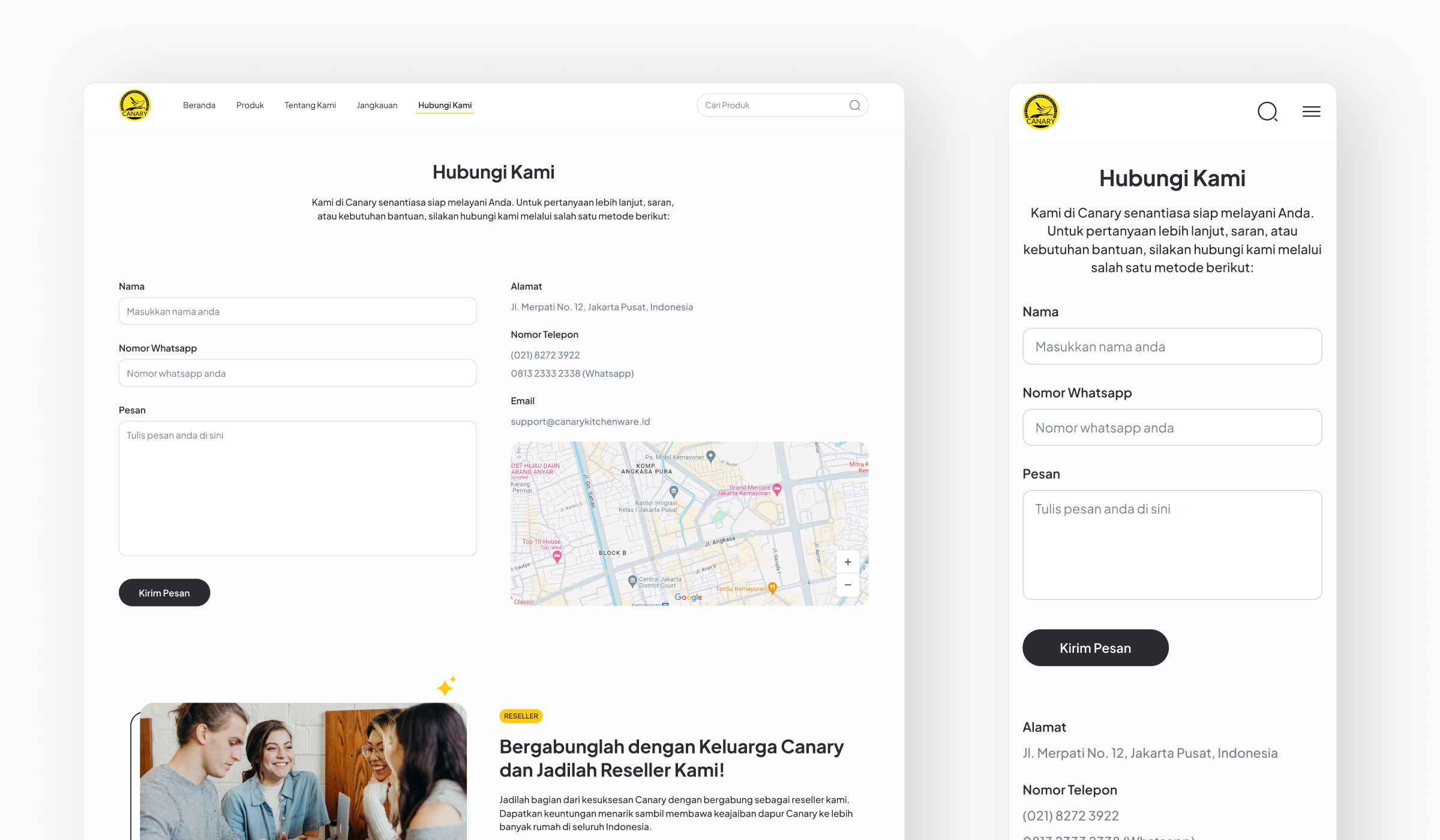
The Canary project focuses on delivering an engaging and informative landing page for a brand that specializes in premium kitchen products. By prioritizing user experience and visual appeal, we’ve created a platform that effectively highlights the brand’s unique offerings, making it easier for potential customers to explore and purchase kitchen essentials.

Our design emphasizes intuitive navigation and a streamlined purchasing process, ensuring users can quickly find what they need without confusion. The landing page also strengthens Canary’s brand identity, providing a seamless and informative experience that guides customers through the product range and encourages them to make confident purchasing decisions.

Color palette

/ Canary
Primary
#FFC915
 

R 255
G 201
B 21
  

Golden Yellow

Font
#2B2C32
 

R 43
G 44
B 50
  

Charcoal Gray

Background
#FFFFFF
 

R 255
G 255
B 255
  

Pure White

The combination of Azure Mist as the primary color brings a refreshing and calming vibe, symbolizing the endless possibilities of knowledge and creativity within the world of books. This shade of blue evokes trust, clarity, and inspiration, aligning with Literary Heaven’s mission to foster a love for reading and empower its community.

The Slate Gray font color offers a sophisticated and modern contrast against the Pure White background, ensuring readability and a clean, professional aesthetic. This neutral tone allows the content to take center stage without overwhelming the user, creating a balanced, user-friendly interface that emphasizes accessibility and clarity. The overall palette reflects the platform’s commitment to simplicity, elegance, and a welcoming experience for all users.

Typography

/ Canary

Typefase
Plus Jakarta Sans

Plus Jakarta Sans is a modern, sans-serif font known for its clean, geometric design and versatile use across digital platforms. Its simple, yet stylish appearance makes it highly legible, offering a contemporary feel while maintaining excellent readability at various sizes.

Plus Jakarta Sans was chosen for its sleek, modern look that aligns perfectly with Canary’s premium brand identity. Its clean lines and legibility make it ideal for both headings and body text, ensuring a seamless and enjoyable reading experience while keeping the design professional and user-friendly.

Aa Bb Cc Dd Ee Ff Gg Hh Ii Jj Kk Ll Mm Nn Oo Pp Qq Rr Ss Tt Uu Vv Ww Xx Yy Zz
0 1 2 3 4 5 6 7 8 9

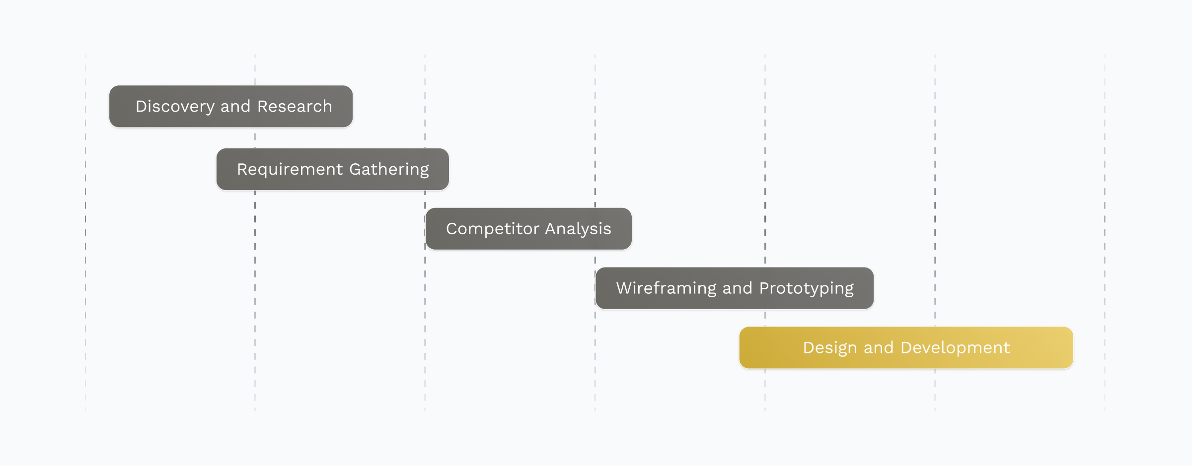
⬤ 03. Design Process

A Seamless Online Experience for Premium Kitchen Essentials

Testimonials

Ready to Collaborate?

Partner with us to create exceptional designs, intuitive dashboards, and scalable products tailored to your needs.
Back